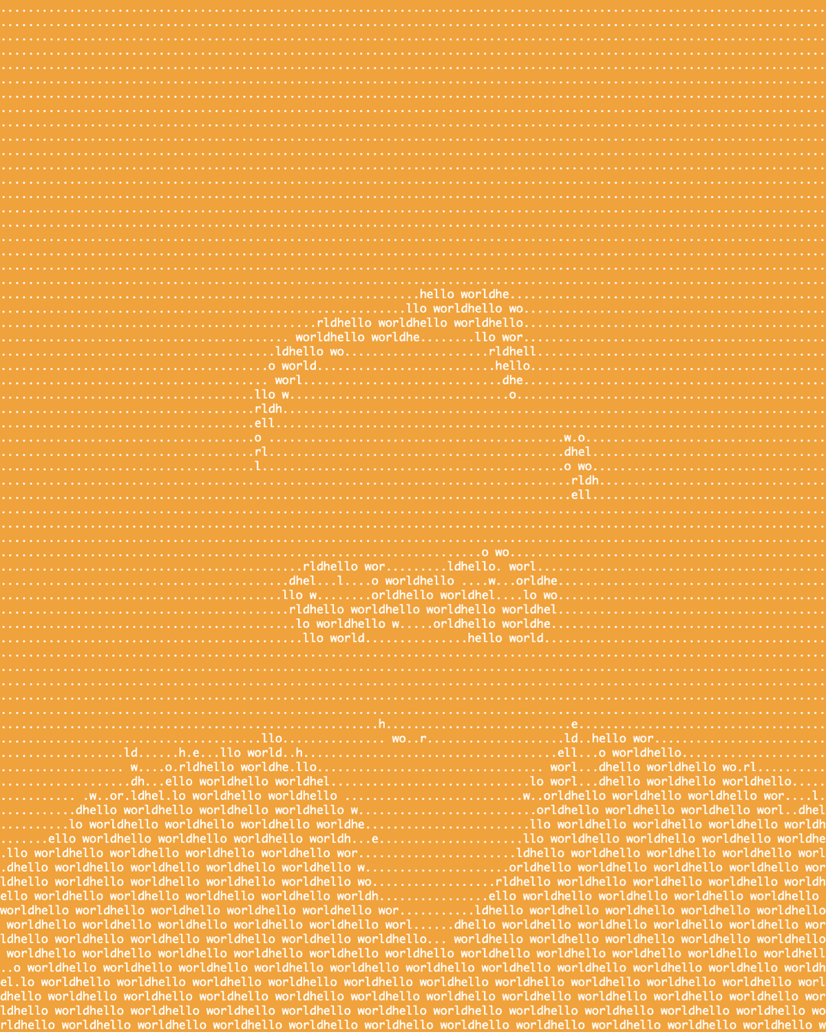
I considered this for the cover, but the seventies amber was too over the top even for me.
- ~/bin/asciiArt face.png --width 120 --palette "hello world" --sequence 0.8 --lighten 3.9 --save hello --bgcolor .995,.621,.037 --fgcolor 1,1,1
The amber I used is the color of many of the screens from the era. And many of those that were just white on black, you could buy screen overlays to make them be amber (or green). The excuse was that it was easier on the eyes, but I think the real reason is that amber and green made their screens look more like people thought a computer ought to look.
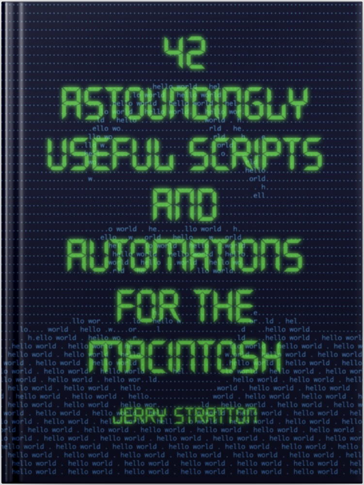
We still have that today: one of the most popular Terminal color schemes is green on black. It’s what I eventually went with for the Astounding Scripts cover.
But this amber ASCII art does highlight another feature of the ASCII art script in 42 Astoundingly Useful Scripts and Automations for the Macintosh: the ability to wash out an image, to brighten it, so as to highlight the areas with the most contrast. The original image had an off white fireplace and a window in the background. Lightening helped remove that, but it also helps when making an image like this to use a photo editor, such as GIMP or GraphicCoverter, to remove everything around the focus of the image. In the end I used the magic wand in GraphicConverter to get rid of the background. The lightening got rid of the lines on my face, highlighting the silly Incredibles Kleenex mask, hair, and shirt.
The argument --lighten 3.9 multiplies every color in the image by 3.9; the argument --sequence 0.8 tells the script to not only use the palette in order (so that it spells “hello world” instead of assumes that those letters are in order by density) but to cut off the sequence when the combined grayscale exceeds 0.8. If you look at the script itself, you’ll see that the default cutoff is 1.0; since there is no way for a greyscale to exceed 1.0 (colors range from 0.0 through 1.0), normally there is no cutoff at all.
Technically, there’s no need to have both a sequence cutoff and a lightening. Providing a low sequence cutoff should have the same effect as providing a high --lighten. I found it easier to conceive of a lightening of the image than a reduction of the cutoff, however. Partly this is because if the lightening brings the greyscale above 1, I have the script set it to 1, so that a non-sequential palette continues to work. A greyscale above 1 would fail, because the palette is normalized to range from 0.0 to 1.0. This also allows for inverting the greyscale value by subtracting it from 1.0; this would make no sense if greyscale values could exceed 1.0.
The asciiArt script becomes more versatile the more I use it. It is the rare script that continues to be as much fun to use as it was to write!
- 42 Astoundingly Useful Scripts and Automations for the Macintosh
- MacOS uses Perl, Python, AppleScript, and Automator and you can write scripts in all of these. Build a talking alarm. Roll dice. Preflight your social media comments. Play music and create ASCII art. Get your retro on and bring your Macintosh into the world of tomorrow with 42 Astoundingly Useful Scripts and Automations for the Macintosh!
- GIMP
- The GIMP image manipulation program is one of the best free software packages of any kind. Fully multi-platform, the GIMP “is suitable for a variety of image manipulation tasks, including photo retouching, image composition, and image construction”.
- GraphicConverter
- “If you haven’t tried GraphicConverter yet, why not give it a spin? It’s one of the most useful products you’ll ever download and one of the best software bargains out there, from one of the most conscientious developers in the shareware universe. There’s really not much more you could ask for.”
- What colour is the dark green on 'old fashioned' green screen computer displays/VDUs? at Stack Overflow
- “I’d like to make my text editors display like the old skool white-on-green VDUs of yore that I can just about remember from my childhood. I have this idea they might be easier on my old eyes.”
ascii art
- Hello World (PNG, 162.7 KB)
- ASCII art of a head and “hello world”.
More ascii art
- Create your own ASCII art palettes with densitySort
- You can create your own ASCII art palettes from special (fixed pitch) fonts and specific collections of characters, using the densitySort script here.
- Random colors in your ASCII art
- One of the great things about writing your own scripts is that when you need new functionality, you can add it. I needed random colors in a single-character ASCII art image. It was easy to add to the asciiArt script. Here’s how.
- Have a Merry Scripting Christmas with Persistence of Vision
- The ASCII Merry Christmas from Astounding Scripts was taken from a scene I created in Persistence of Vision. It’s a very simple scene that highlights many of the advantages of using POV to create images.
- A thousand points of color: give your photos a pointillist turn
- I had far too much fun with that kleenex mask in the book. Here’s a more serious look at creating pointellated images using the asciiArt script in 42 Astounding Scripts.
- Commemorate Patriot Day with Betsy Ross
- The Declaration of Independence overlaid on the Betsy Ross flag.
- Three more pages with the topic ascii art, and other related pages
More Writing Astounding Scripts
- A thousand points of color: give your photos a pointillist turn
- I had far too much fun with that kleenex mask in the book. Here’s a more serious look at creating pointellated images using the asciiArt script in 42 Astounding Scripts.
- About Astounding Scripts
- Because I can!

